Redesigning the Student Dashboard
Redesigning the
Student Dashboard
Redesigning the Student Dashboard
A student dashboard redesign focused on prioritisation and clarity, balancing learning focus and motivation, built on inherited research and decision-driven design under real constraints.
A student dashboard redesign focused on prioritisation and clarity, balancing learning focus and motivation, built on inherited research and decision-driven design under real constraints.
A student dashboard redesign focused on prioritisation and clarity, balancing learning focus and motivation, built on inherited research and decision-driven design under real constraints.
Roles & Responsibilities
Roles & Responsibilities
Roles & Responsibilities
Product Designer
Product Designer
Product Designer
Interpreted inherited research to define design direction
Addressed prioritisation and hierarchy issues
Designed and iterated high-fidelity UI under constraints
Interpreted inherited research to define design direction
Addressed prioritisation and hierarchy issues
Designed and iterated high-fidelity UI under constraints
Interpreted inherited research to define design direction
Addressed prioritisation and hierarchy issues
Designed and iterated high-fidelity UI under constraints
Project Context
Project Context
Project Context
Timeline: January 2025 – February 2025
Timeline: January 2025 – February 2025
Timeline: January 2025 – February 2025
Company: Mathspace🇦🇺 (EdTech)
Company: Mathspace🇦🇺 (EdTech)
Company: Mathspace🇦🇺 (EdTech)
Product Area: Student Dashboard
Product Area: Student Dashboard
Product Area: Student Dashboard
Overview
Overview
Overview
This project wasn’t about redesigning a dashboard. It was about helping students understand what matters next.
This project wasn’t about redesigning a dashboard. It was about helping students understand what matters next.
This project wasn’t about redesigning a dashboard. It was about helping students understand what matters next.
Inherited research and an early design mid-project
Tasked to improve clarity and hierarchy under tight constraints
Design Goal
Incrementally improve clarity and hierarchy, keeping assigned tasks as the primary focus while making gamification visible without disruption.
Inherited research and an early design mid-project
Tasked to improve clarity and hierarchy under tight constraints
Design Goal
Incrementally improve clarity and hierarchy, keeping assigned tasks as the primary focus while making gamification visible without disruption.
Inherited research and an early design mid-project
Tasked to improve clarity and hierarchy under tight constraints
Design Goal
Incrementally improve clarity and hierarchy, keeping assigned tasks as the primary focus while making gamification visible without disruption.
Context & Challenge
Context & Challenge
Context & Challenge
Key issues identified:
Gamification elements drove engagement but directly competed with task focus
Some elements were too intrusive, others too hidden
Visual clutter increased cognitive load and slowed orientation
Key issues identified:
Gamification elements drove engagement but directly competed with task focus
Some elements were too intrusive, others too hidden
Visual clutter increased cognitive load and slowed orientation
Key issues identified:
Gamification elements drove engagement but directly competed with task focus
Some elements were too intrusive, others too hidden
Visual clutter increased cognitive load and slowed orientation
The challenge wasn’t about adding more engagement. It was about placing motivational elements correctly.
The challenge wasn’t about adding more engagement. It was about placing motivational elements correctly.
The challenge wasn’t about adding more engagement. It was about placing motivational elements correctly.
Auditing What Already Existed
Auditing What Already Existed
Auditing What Already Existed
Before proposing changes, I audited both the live dashboard and the initial redesign to understand how they behaved in real use, not just how they looked.
The goal of this audit was to identify where clarity broke down, how students oriented themselves on the page, and why prioritisation felt difficult despite the presence of helpful features.
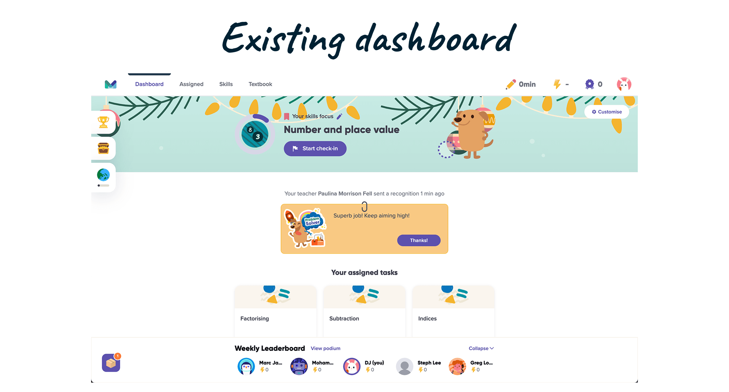
Existing Dashboard (Live)
Existing Dashboard (Live)
Existing Dashboard (Live)
The live dashboard surfaced a recurring pattern: too many elements were competing at the same visual level.
While gamification features such as the leaderboard were effective in driving engagement, their implementation introduced several usability issues:
The live dashboard surfaced a recurring pattern: too many elements were competing at the same visual level.
While gamification features such as the leaderboard were effective in driving engagement, their implementation introduced several usability issues:
The live dashboard surfaced a recurring pattern: too many elements were competing at the same visual level.
While gamification features such as the leaderboard were effective in driving engagement, their implementation introduced several usability issues:

The dashboard functioned, but it didn’t orient the student.
The dashboard functioned, but it didn’t orient the student.
The dashboard functioned, but it didn’t orient the student.
Initial Redesign Proposal
Initial Redesign Proposal
Initial Redesign Proposal
I also reviewed the initial redesign created during the earlier research phase.
While the proposal addressed some visual issues, several core problems remained:
I also reviewed the initial redesign created during the earlier research phase.
While the proposal addressed some visual issues, several core problems remained:
I also reviewed the initial redesign created during the earlier research phase.
While the proposal addressed some visual issues, several core problems remained:
Although the redesign looked cleaner, it did not fully resolve the underlying issue of prioritisation.
Although the redesign looked cleaner, it did not fully resolve the underlying issue of prioritisation.
Although the redesign looked cleaner, it did not fully resolve the underlying issue of prioritisation.
Across both the live dashboard and the initial redesign, the same insight emerged:
"The interface presented information, but failed to establish priority."
This audit clarified that the problem was not about removing or adding features, it was about how elements were placed, weighted, and sequenced within the dashboard.
Key Takeaway from the Audit
Key Takeaway from the Audit
Key Takeaway from the Audit
The audit clarified a clear direction for the redesign:
Assigned tasks needed to visually dominate the dashboard, helping students immediately understand what to focus on next.
Gamification elements needed to remain visible, but act as supporting signals rather than competing for attention.
Hierarchy and placement mattered more than adding new features or visual treatments.
Ultimately, the issue wasn’t missing functionality, it was how attention was distributed across the dashboard.
These insights became the foundation for the design direction and key decisions that followed.
These insights became the foundation for the design direction and key decisions that followed.
These insights became the foundation for the design direction and key decisions that followed.
Design Direction & Key Decisions
Design Direction & Key Decisions
Design Direction & Key Decisions
At this stage, time became a critical constraint.
Alignment was needed quickly, and abstract discussions were slowing progress.
At this stage, time became a critical constraint.
Alignment was needed quickly, and abstract discussions were slowing progress.
At this stage, time became a critical constraint.
Alignment was needed quickly, and abstract discussions were slowing progress.
To accelerate decision-making and reduce ambiguity, I moved directly to high-fidelity wireframes. This allowed stakeholders to react to something concrete and helped validate hierarchy, flow, and behavioural impact early.
To accelerate decision-making and reduce ambiguity, I moved directly to high-fidelity wireframes. This allowed stakeholders to react to something concrete and helped validate hierarchy, flow, and behavioural impact early.
To accelerate decision-making and reduce ambiguity, I moved directly to high-fidelity wireframes. This allowed stakeholders to react to something concrete and helped validate hierarchy, flow, and behavioural impact early.
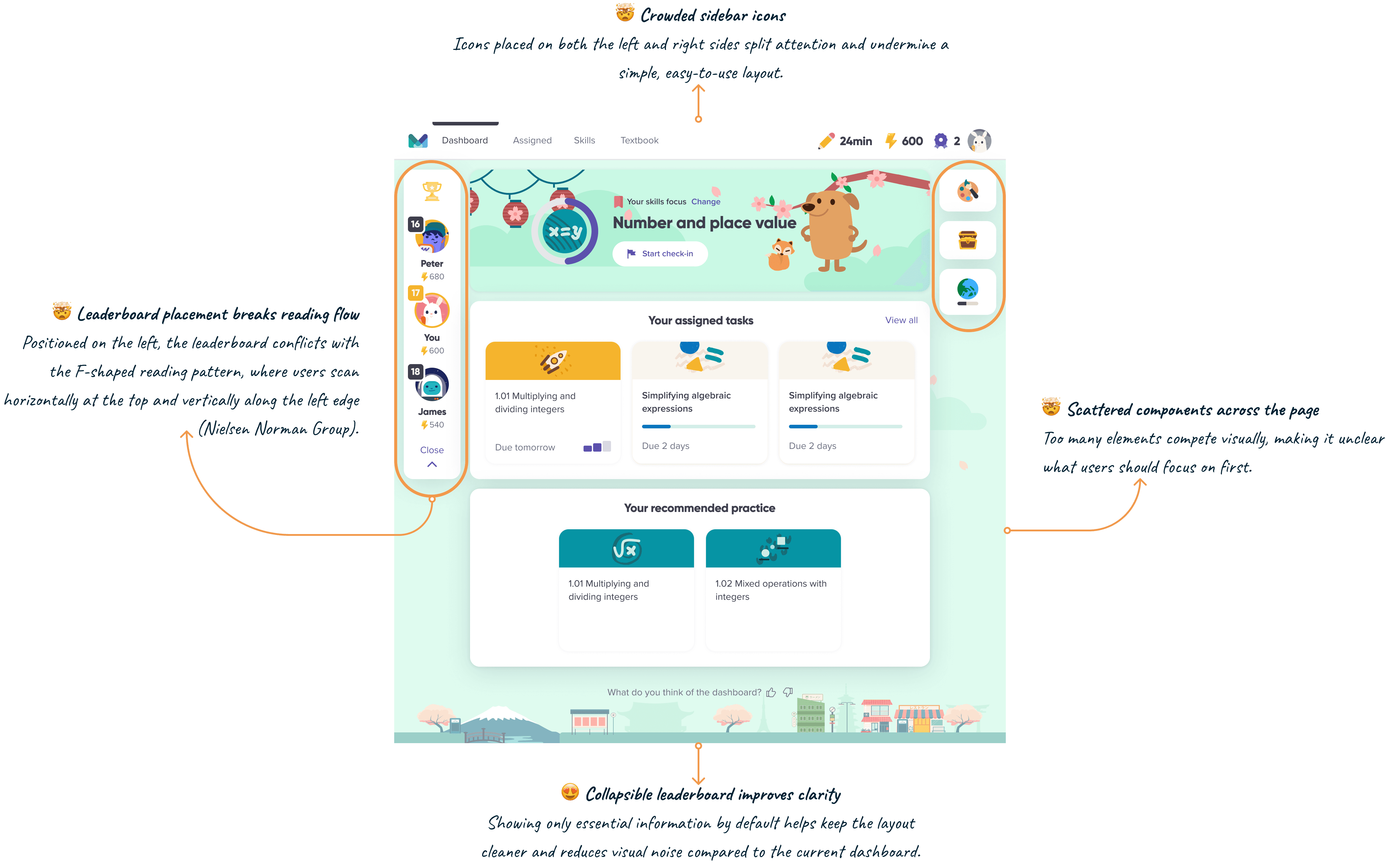
Key Layout Decision: Rebalancing Attention
Key Layout Decision: Rebalancing Attention
Key Layout Decision: Rebalancing Attention
Based on the audit findings, the redesign focused on correcting how attention was distributed across the dashboard.
The key decisions were:
Assigned tasks remain the primary focal point, positioned within the main reading path
The leaderboard is placed on the right, keeping it visible while preventing it from interrupting task scanning
An F-shaped reading pattern guides layout decisions, ensuring secondary elements appear only after core content is scanned
Familiar layout patterns are preserved to minimise relearning and reduce friction
Rather than introducing new interactions, clarity came from hierarchy, placement, and visual weighting.
To validate the direction, I explored two layout options focusing on hierarchy and leaderboard placement.
To validate the direction, I explored two layout options focusing on hierarchy and leaderboard placement.
To validate the direction, I explored two layout options focusing on hierarchy and leaderboard placement.

Rather than selecting a single option, the final direction combined the strongest elements from both explorations.
The banner from Option 2 was retained as the primary visual entry point, reinforcing focus and progress at the top of the page.
The right-side structure from Option 1 was adopted to group gamification elements into a single, coherent section.
This ensured supporting features remained visible and discoverable, without pushing them too far down the page or competing with assigned tasks.

This synthesis preserved task prioritisation while improving the visibility and organisation of motivational elements, addressing the key shortcomings identified in both options.
This synthesis preserved task prioritisation while improving the visibility and organisation of motivational elements, addressing the key shortcomings identified in both options.
This synthesis preserved task prioritisation while improving the visibility and organisation of motivational elements, addressing the key shortcomings identified in both options.
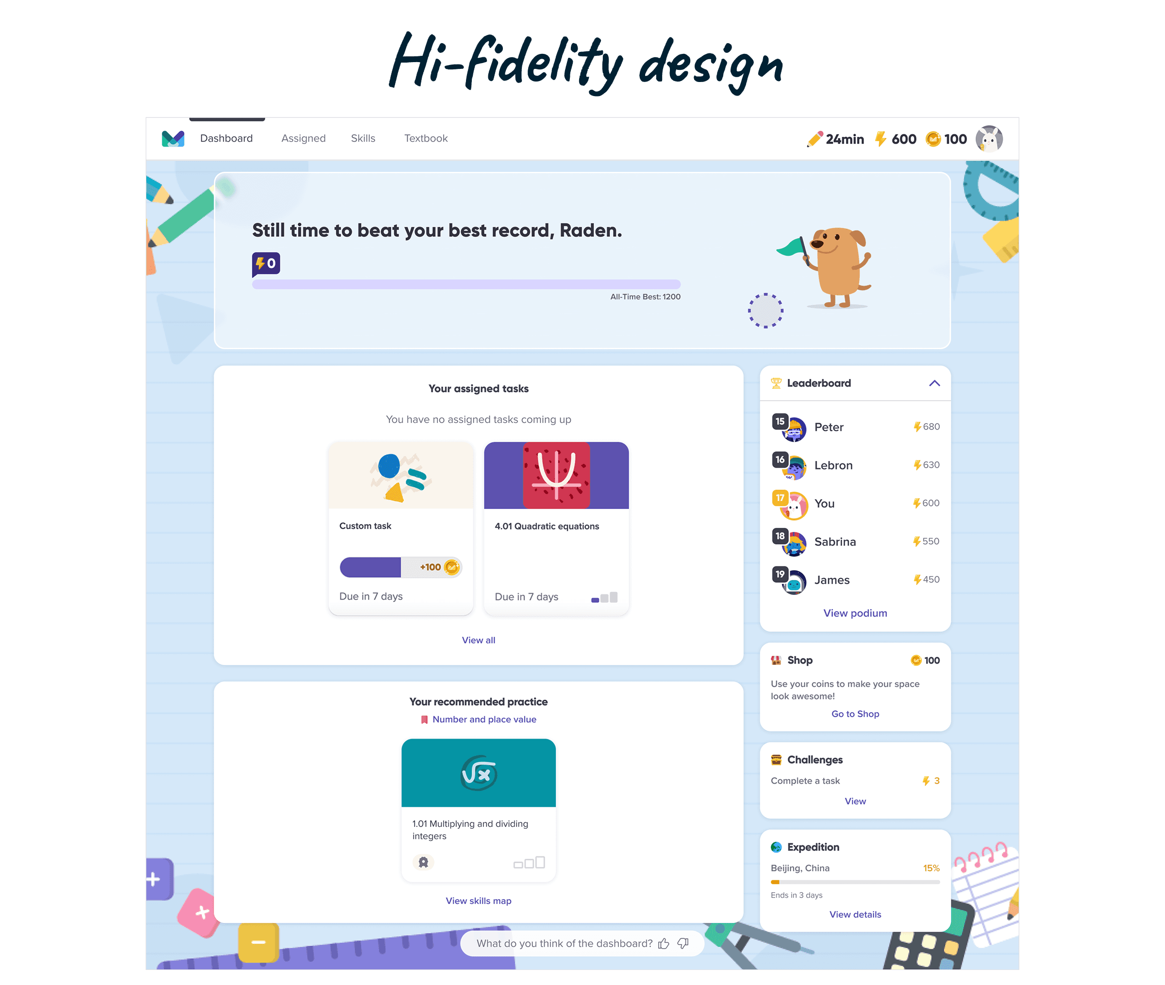
From Wireframe to High-Fidelity Design
From Wireframe to High-Fidelity Design
From Wireframe to High-Fidelity Design
Once the direction was agreed upon, the selected layout was translated into a full high-fidelity design, refining visual hierarchy, spacing, and interaction details while keeping the structure intact.
Once the direction was agreed upon, the selected layout was translated into a full high-fidelity design, refining visual hierarchy, spacing, and interaction details while keeping the structure intact.
Once the direction was agreed upon, the selected layout was translated into a full high-fidelity design, refining visual hierarchy, spacing, and interaction details while keeping the structure intact.
With the design direction stabilised, I partnered with a researcher to conduct usability testing to validate clarity, task focus, and overall comprehension before moving forward.
With the design direction stabilised, I partnered with a researcher to conduct usability testing to validate clarity, task focus, and overall comprehension before moving forward.
With the design direction stabilised, I partnered with a researcher to conduct usability testing to validate clarity, task focus, and overall comprehension before moving forward.
Usability Testing & Validation
Usability Testing & Validation
Usability Testing & Validation
Purpose of Testing
Purpose of Testing
Purpose of Testing
With the design direction stabilised, the next step was to validate whether the redesigned dashboard actually helped students understand what to focus on next, without sacrificing motivation.
The goal of usability testing was not to explore new features, but to confirm:
clarity of the layout
task prioritisation
and overall comprehension of the dashboard structure
This ensured the redesign addressed the core problem identified earlier: attention and hierarchy, before moving forward.
Testing Setup
Testing Setup
Testing Setup
Method: Moderated usability testing
Participants: Students actively using Mathspace
Scope: Student Dashboard (assigned tasks, progress banner, leaderboard, supporting gamification)
Prototype: High-fidelity interactive prototype
Focus Areas: First impressions, task scanning, clarity of next actions
Sessions focused on observing how quickly students could orient themselves and decide what to do next.
Key Feedback & Observations
Key Feedback & Observations
Key Feedback & Observations
Immediate positive first impression
Students consistently responded positively to the bento layout and use of colour, describing it as more engaging and less overwhelming than the current dashboard.Leaderboard supports motivation, not distraction
The leaderboard’s placement was well received and perceived as an indicator of academic progress rather than a game, helping motivation without interrupting task focus.Clear visibility of daily challenges
Prominent placement of daily challenges helped students stay aware and motivated, with suggestions for optional reminders to maintain engagement over time.Desire for personalisation and control
Students expressed interest in customising themes or rearranging dashboard sections, indicating a sense of ownership and comfort with the layout.
Validation Outcome
Validation Outcome
Validation Outcome
Usability testing confirmed that the redesigned dashboard successfully achieved its core goals:
Students felt more motivated without feeling distracted
Assigned tasks remained clearly prioritised
Gamification elements were seen as supportive, not competitive
The bento layout improved clarity, engagement, and overall comfort
Crucially, no major usability issues or blockers were identified,
allowing the design to move forward with confidence.
Crucially, no major usability issues or blockers were identified, allowing the design to move forward with confidence.
Crucially, no major usability issues or blockers were identified,
allowing the design to move forward with confidence.
Outcome & Impact
Outcome & Impact
Outcome & Impact
Usability testing with students actively using Mathspace validated that the redesigned dashboard achieved its intended outcomes, improving clarity, focus, and motivation without introducing disruption.
Rather than measuring success through feature adoption alone, the impact was assessed through how confidently students could orient themselves, prioritise tasks, and interpret motivational signals within the dashboard.
Student Impact
Student Impact
Student Impact
Clearer focus from first interaction
Across all usability sessions, students were able to quickly identify what they should work on next. The redesigned hierarchy reduced hesitation and helped students orient themselves without additional explanation.Motivation without distraction
The leaderboard and supporting gamification elements were consistently perceived as indicators of progress rather than games. Students described them as motivating, while still allowing assigned tasks to remain the primary focus.Positive first impressions
Every participant responded positively on first exposure to the new layout, highlighting improved colour usage, clarity, and overall comfort compared to the existing dashboard.Sense of ownership and engagement
Multiple students independently expressed interest in personalising themes or rearranging sections — a strong signal of comfort, trust, and emotional engagement with the interface.
Signals of Success
Signals of Success
Signals of Success
5 / 5 Positive First Reactions
5 / 5 Positive First Reactions
5 / 5 Positive First Reactions
All tested students responded positively on first exposure, signalling immediate clarity, comfort, and visual appeal.
All tested students responded positively on first exposure, signalling immediate clarity, comfort, and visual appeal.
All tested students responded positively on first exposure, signalling immediate clarity, comfort, and visual appeal.
100% Leaderboard Acceptance
100% Leaderboard Acceptance
100% Leaderboard Acceptance
Every tested student accepted the leaderboard’s placement, with none perceiving it as distracting from learning tasks.
Every tested student accepted the leaderboard’s placement, with none perceiving it as distracting from learning tasks.
Every tested student accepted the leaderboard’s placement, with none perceiving it as distracting from learning tasks.
0 Critical Usability Issues
0 Critical Usability Issues
0 Critical Usability Issues
No blockers, confusion points, or task flow breakdowns were identified during moderated usability testing.
No blockers, confusion points, or task flow breakdowns were identified during moderated usability testing.
No blockers, confusion points, or task flow breakdowns were identified during moderated usability testing.
Early Signals of Ownership
Early Signals of Ownership
Early Signals of Ownership
Students independently asked for theme and layout customisation.
Students independently asked for theme and layout customisation.
Students independently asked for theme and layout customisation.
Business Impact
Business Impact
Business Impact
From a product and business perspective, the redesign reduced risk while increasing confidence in rollout:
Lower disruption risk
By preserving familiar patterns and improving clarity through hierarchy and placement, the redesign minimised behavioural relearning for existing students.Stronger alignment with learning outcomes
Keeping assigned tasks visually dominant ensured the dashboard continued to support Mathspace’s core educational mission, not just engagement metrics.Foundation for scalable gamification
Grouping motivational elements into a coherent secondary structure created a scalable framework for future features without cluttering the primary learning experience.
The redesign successfully balanced focus and motivation, helping students understand
what matters next while maintaining engagement.
The redesign successfully balanced focus and motivation, helping students understand what matters next while maintaining engagement.
The redesign successfully balanced focus and motivation, helping students understand what matters next while maintaining engagement.
Reflection & Learnings
Reflection & Learnings
Reflection & Learnings
1. Clarity Comes from Attention Management, Not Features
1. Clarity Comes from Attention Management, Not Features
1. Clarity Comes from Attention Management, Not Features
This project reinforced that clarity is rarely a feature problem, it’s an attention problem.
Both the existing dashboard and the initial redesign contained similar elements, yet neither clearly guided students toward what mattered next. The biggest improvement came from rebalancing visual hierarchy and placement, allowing learning tasks to naturally lead the experience without removing or adding functionality.
2. Wireframe Can Accelerate Alignment When Used Intentionally
2. Wireframe Can Accelerate Alignment When Used Intentionally
2. Wireframe Can Accelerate Alignment When Used Intentionally
Moving early into high-fidelity wireframes was a deliberate decision driven by time constraints and stakeholder complexity.
Rather than locking decisions too early, high-fidelity wireframe exploration reduced ambiguity, grounded conversations in real behaviour, and accelerated cross-functional alignment. The key learning was that fidelity is a strategic tool, not a measure of design completeness.
3. Motivation Is Most Effective When It Supports, Not Competes
3. Motivation Is Most Effective When It Supports, Not Competes
3. Motivation Is Most Effective When It Supports, Not Competes
Usability testing revealed that students viewed the leaderboard not as a game, but as a signal of academic progress.
Designing motivational elements as secondary, supportive signals visible but restrained, proved more effective than making them dominant. This reinforced the importance of treating gamification as a confidence booster, not a competing call to action.
Closing Summary
Closing Summary
Closing Summary
This project demonstrated that meaningful impact doesn’t always come from introducing new features or interactions.
By focusing on hierarchy, placement, and incremental change, the redesigned Student Dashboard helped students understand what matters next while preserving motivation and minimising disruption.
The outcome was a clearer, more confident learning experience, validated by real students and a scalable foundation for future gamification within Mathspace.
More of my work
More of my work
More of my work


Senior Product Designer with 7+ years of experience, focused on product thinking, education, and mentorship.
© 2026 Raden Rizqan // ICHAN — Built with intention.
Senior Product Designer with 7+ years of experience, focused on product thinking, education, and mentorship.
© 2026 Raden Rizqan // ICHAN — Built with intention.
Senior Product Designer with 7+ years of experience, focused on product thinking, education, and mentorship.
© 2026 Raden Rizqan // ICHAN — Built with intention.